 CartVisual
DIAGNOSTIC GUIDE / Product images
How do I show an iridescent product when its color changes with the viewing angle?
Treat angle-shifting color as a viewing condition, not as a set of hidden color variants. Photograph the same physical SKU from repeatable angles, record the light source and observation, and use supporting close-ups or a short manual edit to show the transition. Approve each image against the physical product before external store publishing.
Diagnose the appearance before creating images
One possible failure is classification: angle- or light-dependent appearance is presented as a new sellable color. Confirm the actual SKU and product documentation before deciding whether two views show the same finish. 3M describes its Dichroic Glass Finishes as changing appearance with viewing angle and lighting, with different reflection and transmission colors. That is a specific film example, not evidence that this phone case or every iridescent product uses that material. Preserve fixed shape, marks and surface details while recording what the actual sample does.
Use a physical reference under a controlled, repeatable setup. Record the camera position, product rotation, light direction and the plain-language appearance you actually observe, such as “green edge highlight with violet center.” This is an observation record, not a spectral measurement or a claim that every customer will see the same color. Keep lighting notes separate from angle notes so a warm lamp is not mistaken for a new finish.
Build an angle-and-light evidence set
Create a small set that answers two different questions: what is this product, and how does its appearance change? Use one neutral identification view, one or more rotated views, and a detail view of the surface. Keep the same SKU, background treatment and product scale where possible. Label the angle and lighting in the working file or review sheet, even if those labels are removed from the customer-facing image.
If you use CartVisual, text planning is free after sign-in; image or video work has separate quotes. Treat generated visuals as drafts that require comparison with the physical reference. External photography, retouching, editing and store publishing remain manual workflows. A virtual try-on view can help show presentation context, but it is not evidence of fit or proof of the product’s optical finish.
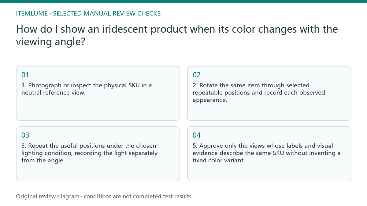
- 1. Photograph or inspect the physical SKU in a neutral reference view.
- 2. Rotate the same item through selected repeatable positions and record each observed appearance.
- 3. Repeat the useful positions under the chosen lighting condition, recording the light separately from the angle.
- 4. Compare every draft image with the corresponding reference, checking shape, markings, surface pattern and color transition.
- 5. Approve only the views whose labels and visual evidence describe the same SKU without inventing a fixed color variant.
Review the image as evidence, not decoration
Check the product before judging the scene. Look for a changed silhouette, missing logo or printed detail, smoothed texture, invented seam, or a highlight that has moved to an impossible location. Then check the viewing condition: does the stated angle match the visible transition, and is the light direction consistent? A polished scene cannot repair a misleading product record.
Use an approval sheet with view, lighting, observed appearance and decision columns. If a short comparison helps shoppers understand the shift, arrange approved stills in an external manual edit and keep each viewing condition identified. A generated transition may invent intermediate colors, so it is not evidence of the real finish. CartVisual planning and any separately quoted media do not publish the comparison to a store or replace checking the actual product.
Fictional worked example and stopping rule
Fictional example: Lina, a fictional accessories seller, had one fictional SKU, the fictional “Prism Loop Case.” Her first draft showed a turquoise front, magenta rim and gold reflection in one view. The exact failure was not that the product changed color; it was that one synthetic image combined three observations from different angles and lighting, making the item look like a fixed multicolor finish. She changed one thing first: she replaced the composite image with a neutral front view under one recorded light. The result was easier to identify, but it did not show the angle shift.
She then changed only the product rotation and added a second approved view under the same light. The result showed a turquoise-to-violet transition without creating another SKU. She added a separately labelled side view under a warmer lamp only after recording that lighting change. Her stopping rule was reached when three approved views covered identification, transition and surface detail, and each view matched the physical reference with no unexplained mark, shape or finish. She stopped adding angles because extra views were repeating the same evidence, not because a universal color limit had been met.
Angle-shifting product review table
| Observation | What to check | Approval condition |
|---|---|---|
| The front looks turquoise, but the rim looks violet | Confirm whether the rim is a rotation effect or a separate physical part | The actual catalog record establishes whether both views show the same SKU; labels and fixed details agree with that record |
| A bright gold band appears only in one image | Compare light direction and product rotation | The band is explained by the recorded condition or removed |
| The generated surface looks uniformly metallic | Compare texture, pattern and highlight movement with the physical item | No invented finish replaces the observed surface |
| Two images suggest different fixed colors | Check whether angle and lighting notes were mixed | The sequence identifies the verified SKU relationship and viewing conditions without inventing another finish |
Use this matrix as a manual review record and add your own real evidence. Its conditions are not completed test results.
Sources and further reading
Recorded source-review dates are listed individually below. An undated source does not inherit the article’s publication date. Software and platform rules can change; check the current original before acting.
- CartVisual: editorial policy and product scope · Review date not separately recorded
- Photoroom: How to make AI product images look real · Reviewed
- Shopify: Product Photography DIY Guide · Review date not separately recorded
- 3M Australia: Dichroic Glass Finishes · Reviewed
Frequently asked questions
Should I create a separate color variant for every visible shade?
No. First determine whether the shade is caused by angle or lighting. Keep it attached to the same SKU unless the physical product is actually sold as a distinct variant.
Can one image prove the product’s full iridescent effect?
Usually it cannot communicate a changing appearance reliably. Use a neutral identification view plus labelled, approved angle views or an externally edited sequence.
When should I stop adding views?
Stop when the approved set covers identification, the meaningful transition and surface detail, with angle and lighting records that match the physical reference. Do not add views that repeat the same evidence.
PREPARE ASSETS FOR YOUR NEXT STEP
Create supporting product assets in CartVisual.
Create new product creative assets in the workspace, then continue in your chosen tools. Third-party software procedures described in this guide take place in those applications; this workspace link does not imply an integration. Check current capabilities, account access and credit quotes.
Explore asset creation tools Check pricing and credits