 CartVisual
PRACTICAL ANSWER / Product images
Why is one side of my product warm and the other side blue?
A warm side and a blue side often indicate competing light sources, such as a ceiling lamp and a window. Confirm this by switching off one source and repeating the photograph. A single white-balance setting may not correct a mixed cast reliably; for a critical product reference, a controlled reshoot can be safer than selective repainting.
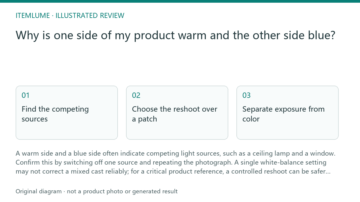
Find the competing sources
Start with the physical setup, not the editing panel. List every source that can reach the product: window light, ceiling fixtures, desk lamps, reflective walls, and light entering from another room. A white mug makes the problem easy to see because its neutral surface reveals both warm and cool illumination.
Look for a boundary rather than judging the whole image at once. If the window-facing side is blue and the ceiling-facing side is yellow, the image probably contains mixed light. A white balance adjustment may make one area look acceptable while pushing the other farther from neutral.
- Photograph a neutral white or gray reference beside the product.
- Turn off the ceiling lamp and compare a second frame using only window light.
- Cover or close the window and compare a third frame using only the warm lamp.
- Keep the source that gives the more even, controllable illumination, then reshoot.
- Stop diagnosing when one source is clearly responsible and the product still has uneven color under that source; change the light position or diffuse it before taking the final reference.
Choose the reshoot over a patch
For a product photo, color consistency matters more than preserving the original frame. Move the mug away from the window, switch off the warm lamp, or block the window temporarily. If both sources are necessary, match their color temperature with compatible lamps and keep their angles consistent.
Do not treat a global temperature slider as proof that the product is accurate. Local masking can reduce a cast in a presentation image, but it can also hide a real finish, glaze, fabric tone, or packaging color. When the product will be used as an AI reference, a clean reshoot gives the model a clearer basis for preserving appearance.
Separate exposure from color
Check brightness and hue separately. A bright window-facing side is not blue simply because it is overexposed. Adobe describes Temp as the yellow/warm versus blue/cool adjustment and Tint as green versus magenta. Use exposure and clipping checks to inspect retained detail; use the light-source comparison and a neutral reference to diagnose the cast. Lowering exposure may reveal retained highlights, but it does not make two different illuminants share one color.
Use a gray card or another known-neutral object when available, and keep it in the same plane as the product. This is workflow advice, not a guarantee of product color accuracy. The final check should compare the photograph with the physical item under neutral viewing conditions, especially for white, cream, silver, and pale colors.
Review before handing it to AI
A scene-generation workflow can preserve the wrong color if the reference already contains conflicting illumination. Before uploading or approving a reference, inspect the front, side, handle, opening, and printed areas. Look for a warm-to-blue transition that follows the light direction rather than the product’s material.
Fictional exercise, not a measured lighting test: a white mug shows a blue window-facing side and a yellow lamp-facing side. Keep the mug, framing and camera settings fixed and make a comparison with the ceiling lamp off. Test a position change separately only after recording that first comparison. If the warm-to-blue boundary disappears when one source is removed, that supports the mixed-light diagnosis for the example; it does not establish a universal lamp temperature, distance or product-color guarantee.
Mixed-light review
| Observation | Next check | Pass condition |
|---|---|---|
| Window-facing mug side is blue while the top is yellow | Photograph again with the ceiling lamp off | No sharp warm-to-blue boundary remains |
| White surface changes color near the handle | Check whether the handle is receiving a second source or reflection | Handle and body appear consistent under one controlled source |
| The whole frame is orange but evenly lit | Confirm whether only one warm source is active | A neutral reference can be corrected with one white-balance adjustment |
| Color changes remain after one source is removed | Inspect nearby walls, screens, and reflective objects | No competing colored reflection reaches the product |
| A correction makes the mug neutral but damages its printed mark | Discard the patch and reshoot | The product and markings remain recognizable without selective repair |
To prepare a controlled lighting reference before another generation, use Light the real product clearly before asking AI to place it in a new scene..
Sources and further reading
Recorded source-review dates are listed individually below. An undated source does not inherit the article’s publication date. Software and platform rules can change; check the current original before acting.
- CartVisual: editorial scope and evidence · Reviewed
- Photoroom: repeatable product image workflow · Reviewed
- Google Search Central: image publishing guidance · Reviewed
- Adobe Lightroom Classic: Image tone and color · Reviewed
- Auto White-Balance Correction for Mixed-Illuminant Scenes · Reviewed
- Adobe Camera Raw: Make color and tonal adjustments · Reviewed
Frequently asked questions
Can I fix mixed light with two white-balance settings?
Local corrections can sometimes reduce a mixed cast, but first test the light sources separately. For a critical product reference, a controlled reshoot can avoid repainting the product; neither two settings nor a reshoot alone proves accurate color.
Does a gray card solve every color-cast problem?
No. It helps identify a neutral reference, but it cannot make two different light sources illuminate the product identically.
Should I use the window or the warm lamp?
Use the source that gives the most even, controllable light for the product. Test each source separately before choosing.
PREPARE ASSETS FOR YOUR NEXT STEP
Create supporting product assets in CartVisual.
Create new product creative assets in the workspace, then continue in your chosen tools. Third-party software procedures described in this guide take place in those applications; this workspace link does not imply an integration. Check current capabilities, account access and credit quotes.
Explore asset creation tools Check pricing and credits